Headers H1
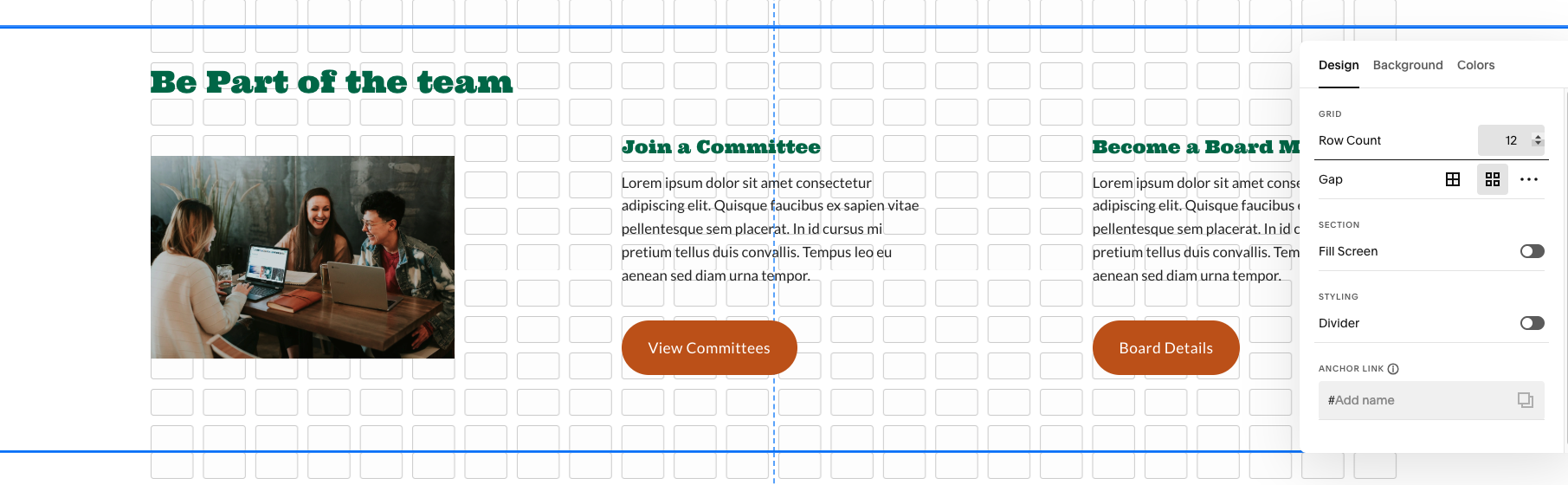
Subhead (p1). Half page layout, 3 rows, height is set to 20. Text begins on second row and is only 1-2 lines.
Main/Parent page = Dark Green. Sub/Child page = Light green.
Heading 1 (3rem)
Heading 2 (2.5rem)
Heading 3 (2rem)
Heading 4 (1.5rem)
H1: Page headers only.
H2 : large sections. Keep 1 row of space between header and content.
H3: large sections. Keep 1 row of space between header and content.
H4: Used for small subsections. Ensure textbox is tight and have no space before content.
Paragraph 1 (1.4rem): Use for subheads.
Paragraph 2 (1.2rem): Use for content on page.
Paragraph 3 (1rem): Use sparingly, mostly for captions or notes.
Page Layout
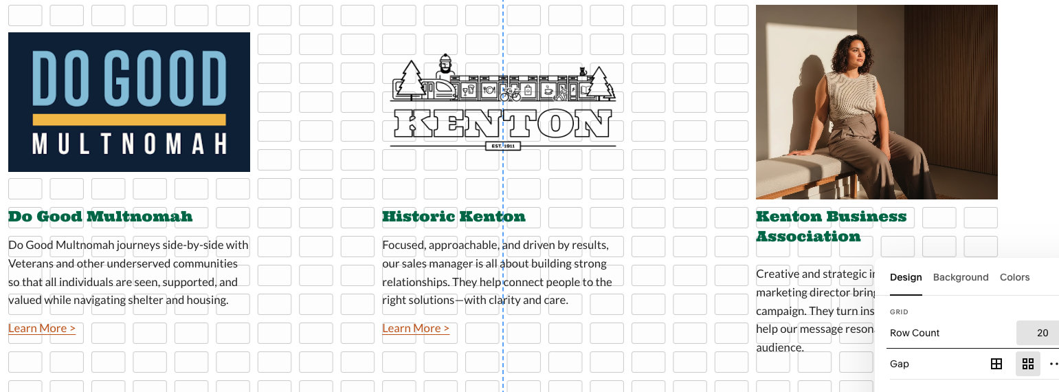
Using the gaps (11 x 11) and boxes as your guide.
Spacing (web and mobile)
From header to first section: 2 rows
Between sections: 3 rows
Last section to footer: 4 rows
Section Settings
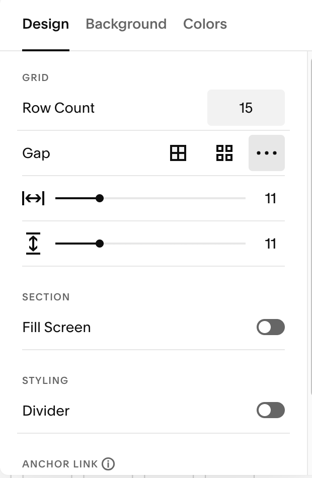
Ensure gap size is 11x11
Turn off “fill screen”
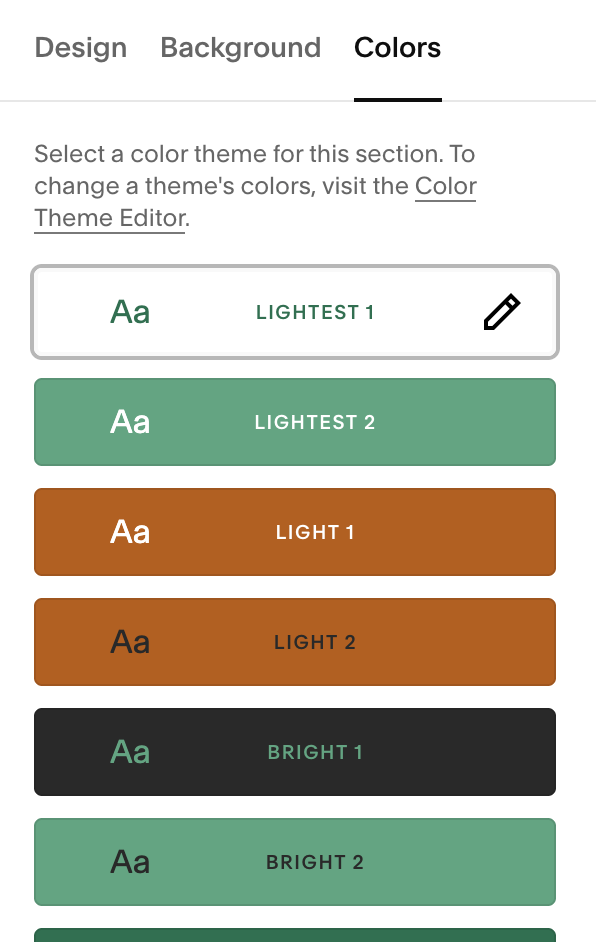
Use Lightest 1 color styles
Page: Even columns
Using the gaps (11 x 11) and boxes as your guide.
1/4 + 1/4 + 1/4 + 1/4 layout
first column: 5 boxes
space: 1 boxes
second column: 5 boxes
space: 2 boxes (center)
third column: 5 boxes
space: 1 box
fourth column: 5 boxes
1/2 + 1/2 layout
first column: 11 boxes
space: 2 boxes (center)
Last column: 11 boxes
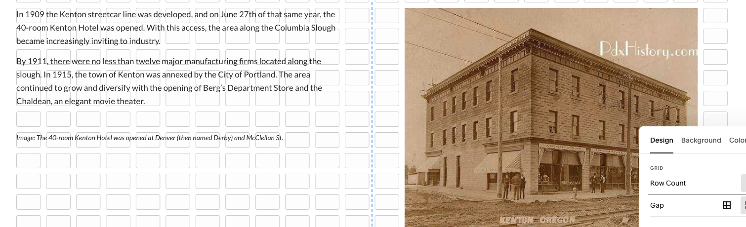
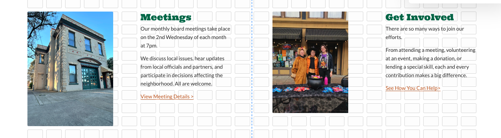
Images
Height aligned with each other or with the headers (depending on layout)
Width matches column spacing.
Height depends on layout needs.
Note: images do not match the guides right now because Morgan is not good at fixing them. Jessica will do images then Morgan will adjust this section.
Page: Odd columns
Using the gaps (11 x 11) and boxes as your guide
1/3 + 1/3 + 1/3 layout
first column: 6 boxes
space: 3 boxes
second column: 6 boxes
space: 3 boxes
Last column: 6 boxes
2/3 + 1/3 layout
first column: 15 boxes
space: 3 boxes
Last column: 6 boxes
Images
Height aligned with each other or with the headers (depending on layout)
Width matches column spacing.
Height depends on layout needs.